5. Theme Customization
SnippetsLab encourages you to personalize the experience by customizing built-in themes or creating new themes from templates. You can change not only syntax highlighting, but nearly all the app’s interface as well.
Note: This section is about customizing the main app theme. To customize the Markdown Preview, see Preview Themes.
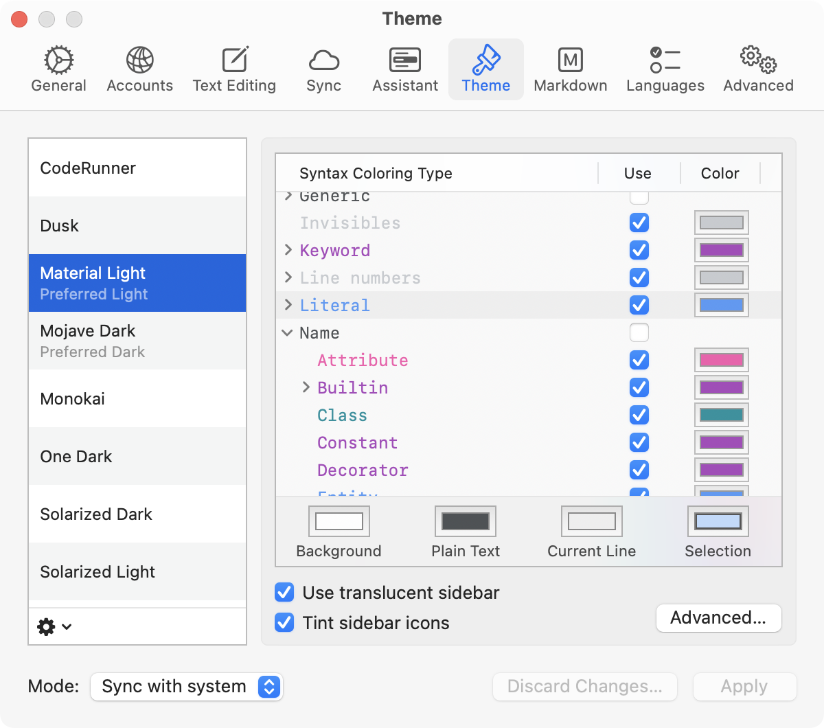
5.1. Theme List
You can see all available themes in Settings > Theme. Here, you can:
Switch themes: Simply click on a theme from the list.
The app can adapt to the system’s light or dark appearance if the theme mode is set to Sync with system. With this enabled, choosing a theme matching the current system appearance will set it as the preferred theme. You can also click
 and select Set As Light/Dark Theme to set the preferred light and dark theme.
When a theme has been edited, its name will be shown in bold.
Manage themes: Use the
button below to access options such as rename, duplicate, or remove a theme.Restore a built-in theme: If you made some changes to a built-in theme but wish to undo them, click
and choose a theme from New Theme From Template. This adds a new copy of the original theme.Reset everything: To revert all themes to the default settings, click
and select Reset All….Please note that this will also delete all custom themes. To preserve a custom theme or any changes that you want to keep, export it first.
Import and Export: Click
and choose Import Theme… or Export Theme…. This allows for easy backup and sharing of custom themes.Disable sync appearance with system: To use a single theme for both light and dark system appearance, choose Single theme from the drop-down menu next to the
button.

By default, SnippetsLab applies a transition effect when switching themes. If you wish to disable this animation temporarily (such as to make it easier to compare two similar-looking themes), hold Option.
5.2. Syntax Colors
In SnippetsLab, syntax types are organized hierarchically, mirroring the structure used by Pygments, the underlying syntax highlighting engine.
All syntax types start with a top-level type—for example, Name or Keyword. Consider these as the primary categories of all syntax types. Each top-level type contains subtypes that are more specific—for example, Name.Attribute, Name.Class, Name.Function, and Name.Variable are all subtypes of Name. This hierarchy may go deeper; for instance, Name.Variable further contains Name.Variable.Class, Name.Variable.Instance, and others. This nesting allows for fine control over syntax coloring at any desired granularity.
In the theme editor, this hierarchical structure is visually represented, where you can expand a type to view its subtypes.
When a color is assigned to a parent type, it is automatically applied to all its descendant types, unless a specific color is already set for a subtype. If a top-level type has no specific color assigned, it defaults to the plain text color.
For more in-depth information about all syntax types, refer to the Builtin Tokens section in the Pygments documentation.
Any changes made to the selected theme are reflected in real time, and are saved automatically when switching to another theme. To undo the changes since the last save, click the Discard Changes… button.
Note
Languages usually do not make use of all the possible syntax types. They only employ a subset of these types that are relevant to the language features.
5.3. App Colors
To reveal more customization options of the app interface, click the Advanced… button. Most of the interface elements have the ability to adapt their appearance based on the surroundings, for example the background color. This makes it easier to make desired customizations without detailed adjustments to every option.
Any changes made in the Advanced section are reflected in real time. To undo the changes, click the Discard Changes… button. Unsaved changes made before opening the Advanced window are not affected.
5.3.1. Background Color and Theme Style
You can set the app-wide background color in General > Background. You can also override the background color for the sidebar, snippets list, and editor by setting the background color in their respective tabs.
There are two theme styles: Light and Dark. The theme style determines the appearance of texts and icons, and potentially windows and menus. The app is usually able to automatically determine the style based on the background color, but you can manually choose one if required.
5.3.2. Wallpaper Tinting
Wallpaper Tinting, introduced in macOS Mojave, subtly adjusts window colors to match the wallpaper behind the window. While only supported by the Mojave Dark theme by default, it can be enabled in other themes through:
Setting the dynamic color
windowBackgroundColoras the app background color.Turning on Enable macOS wallpaper tinting support in the Options tab of advanced theme settings.
5.3.3. Developer Colors
macOS allows customization of certain system-wide colors such as the accent color and text selection color in System Settings > Appearance. Most built-in themes respect these settings by using dynamic developer colors, instead of fixed colors. These colors are available in the color panel under the Color Palettes tab, Developer category.
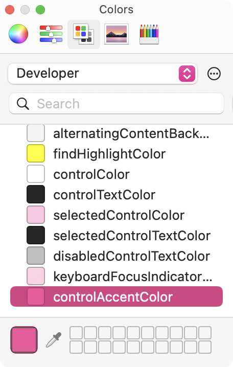
These colors may change based on a variety of system settings, such as appearance, accent color, accessibility settings, and more. The most common ones are the accent color (controlAccentColor), and the text selection color (selectedTextBackgroundColor).
Important
It is recommended to use a regular, static color when possible. Developer colors may change in a way that is not expected by the user, and SnippetsLab’s support for developer colors may vary with future macOS releases.